PLETHORA
Roles:
Creative Direction, Art Direction, Graphic Design, Copywriting, Photography
The “Wave” Typeface
Before the current fluid typography trend, the PLETHORA “Wave” typeface was already on the scene. Who’d have thought a small brand would be about three to four years ahead of the curve? Despite many iterations of fluidity movement-based fonts, none have come close to the Wave typeface.
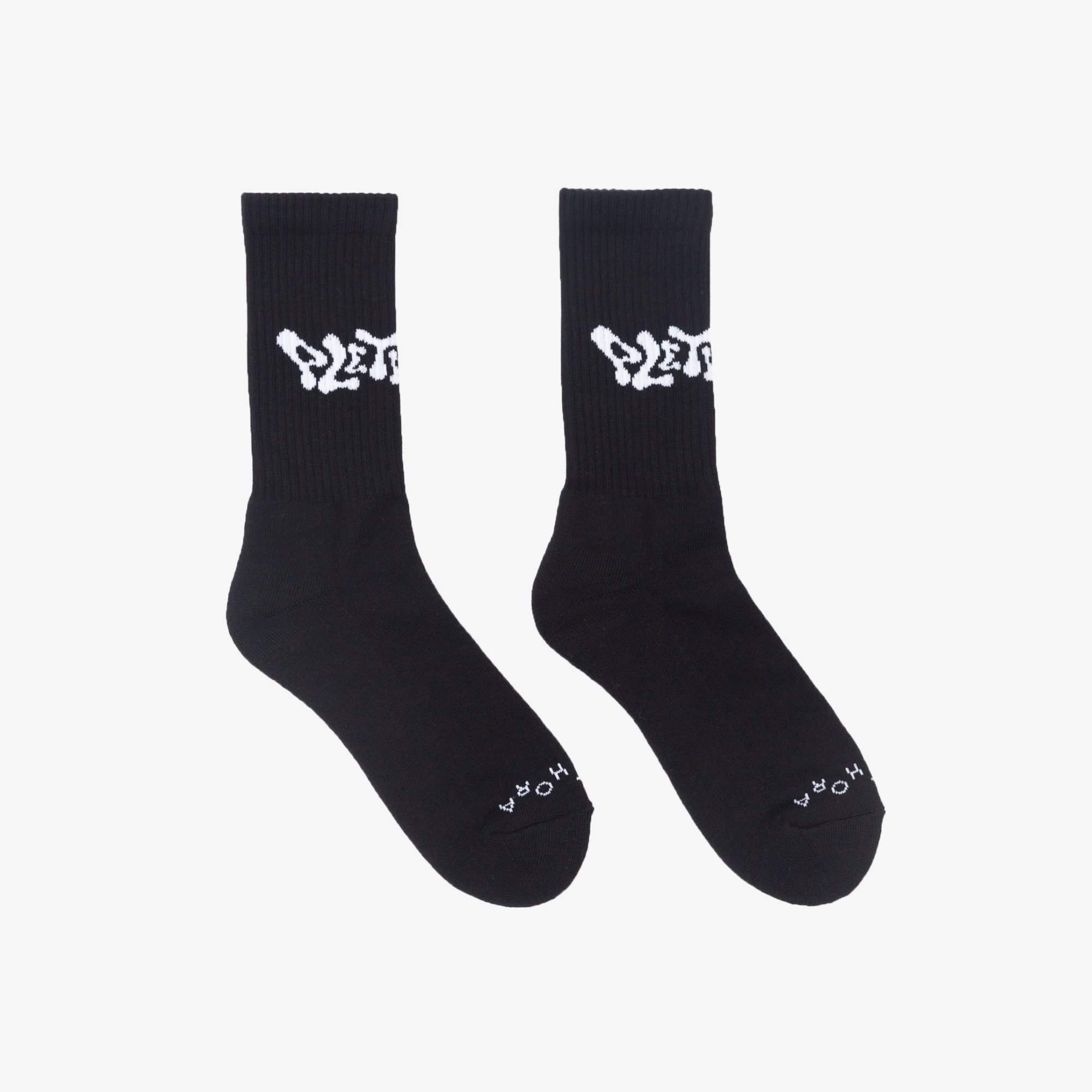
The Wave typeface was created as the company's signature marker of identity. It is a balanced and subtle mix of capital and lowercase variant letters, aqueous indentations, and regardless of kerning, each letter molds into the other seamlessly while remaining distinctly legible. Of course, we needed a logo, but it needed to speak to the messaging, flow, and design direction the brand was heading in.
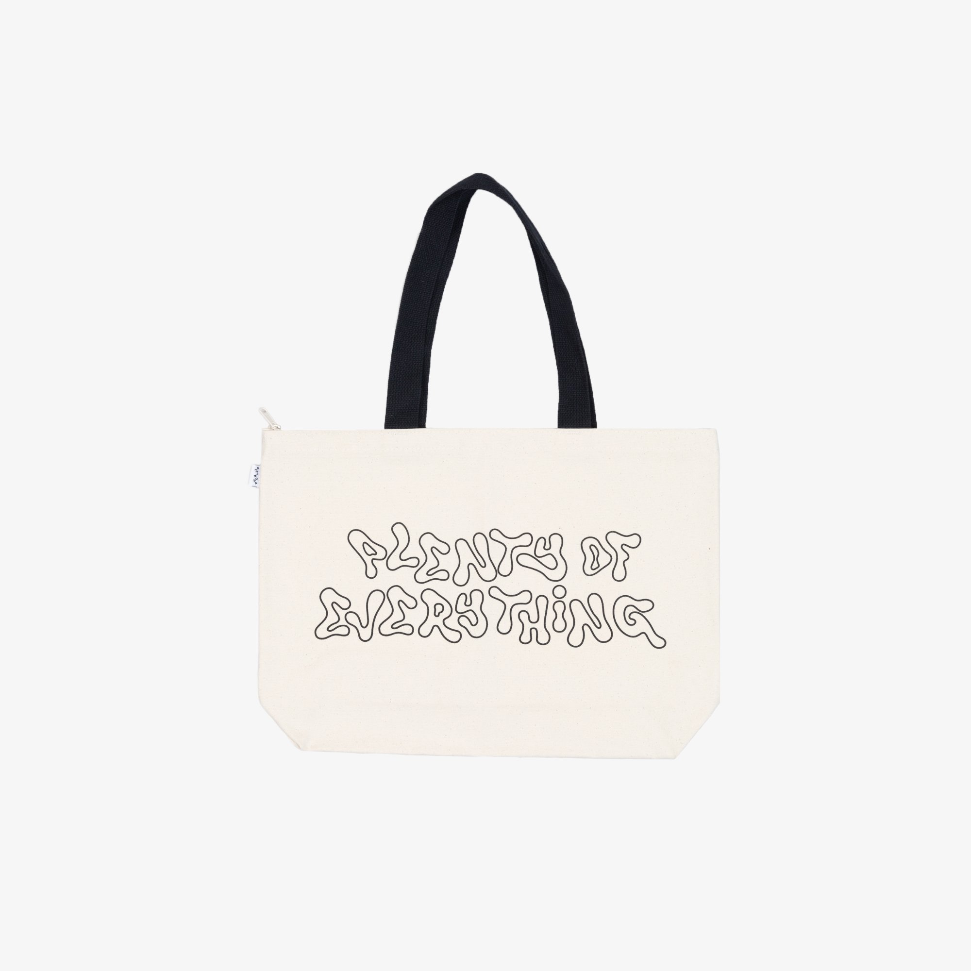
This led to the creation of an entire alphabet. Now that there are more letters to play with, the Wave typeface is seen across platforms such as packaging, promotional accessories, tangible products like the “Abundance” tee, the “Plenty of Everything” tote bag, and more.
Credits:
Creative Director, Art Director, & Graphic Designer: Kayla Reefer
Illustrator & Graphic Designer: David Hernandez (Para Nosotros)
“Tutti Frutti” Advertisements
Credits:
Creative Director, Art Director & Photographer: Kayla Reefer
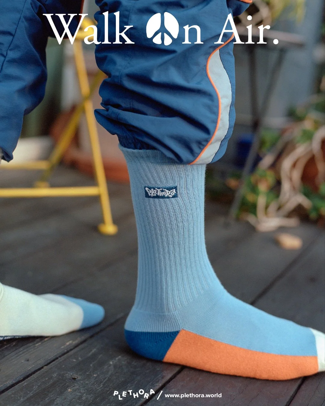
A “sneaker ad” for socks. The “Tutti Fruttis” are a purposely mismatched pair of socks with cleverly located action messaging on the inner bottom feet. Taking note of the timeless ASICS and New Balance advertisements from the 1980s and 90s, “Walk On Air” and “A Step in the Right Direction” allude to the feeling of treading lightly in the most literal sense.


